
A young couple living in the UK, decided to celebrate their intimate summer wedding with an Amalfi style in the romantic city of Verona, well known for Romeo and Juliet.
Read More
A Delicate Pastel Palette for a Summer Vineyard Wedding
A summer wedding on Lake Garda and Valpolicella region. Summer flowers in delicate hues for all the floral decorations
Read More
An Italian vineyard summer wedding
I had the pleasure of organizing all the floral decorations for this lovely English couple’s special day. Hannah and Luke chose a very delicate palette in tones of white, green and a touch of light pink for all the floral decorations. The style was very natural and romantic, perfect for the location.
Read More
Photo @ Valentina Fraccaroli
A medieval castle shoot
An incredible medieval shoot at the beginning of April. Elegant mood and dark tones with burgundy as main colour contrasting with pale tones of peach and pink. Floral arrangment for tablescape, cake design and bridal bouquet
Read More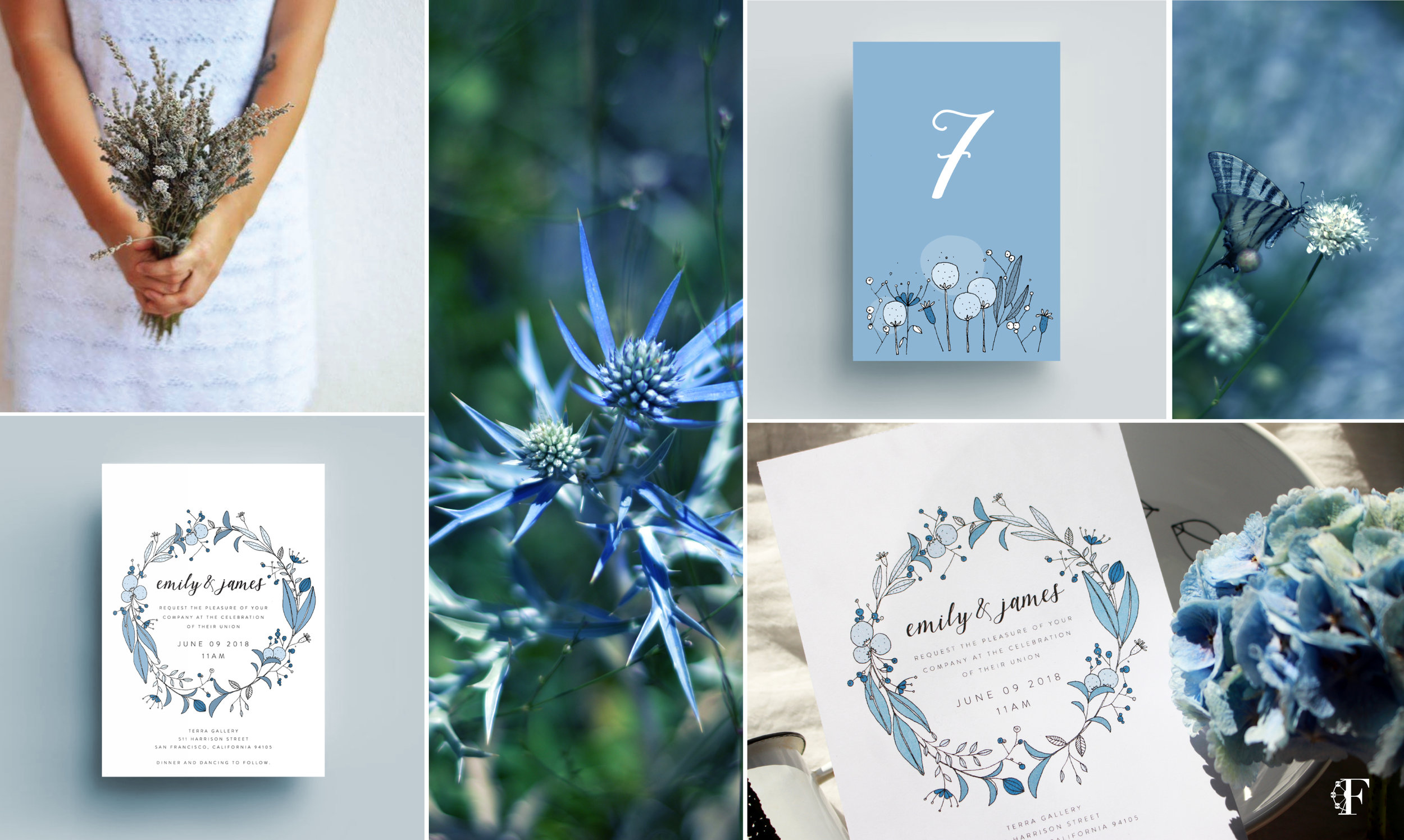
the magical world of pictures meets the magical world of flowers
Floral illustrations and floral moodboard for wedding
Read More
4 reasons to choose carnations
Today I would like to write about carnation, a flower that is very often underestimated without being able to stand up for itself. These opinions come from the past when the floral arrangements were very basic or because here in Italy the custom is to use them on sad occasions. But I think the time has arrived to open up the doors to this special flower which has a lot to offer. Let me give you at least 4 reasons to change your mind about carnations
Read More
Backstage at a Verona wedding
An ispirational shoot in Northern Italy, Verona. Backstage during preparation. Elagant mood for the bridal bouquet in pale pink rose
Read More
YOUR ITALIAN COUNTRY CHIC PICNIC WEDDING
A unique picnic wedding with an unforgettable magical atmosphere in a stylish setting in Northern Italy near Lake Garda and Verona. Natural and loose mood for the floral table decorations. The main flower was the peony and rustic flower
Read More
An autumn wedding with an essential flower
An autumn wedding in the countryside amidst vinyeard. The swedish-english couple had a very clear idea of the style, the hues and the atmosphere that she wanted for their wedding. For the bride being passionate about flowers herself it was important that they played an important role on their special day. Going back to Paula’s wedding she chose a palette made up of different shades of bordeaux, burgundy, green and cream. A touch of light peach was added to give light and to create and edgy contrast. The chocolate hue of her moodboard conveyed elegance, smoothness and consistency.
Read More
A romantic shoot in the vineyards
A romantic inspirational wedding shoot in the vineyards, in Italy. Colours: the choice of the colour is the first thing to decide when planning floral decorations. I pinpointed two main colours: pink and green in different tones. Then I added a touch of burgundy and blue/violet to add intensity and give an edgy contrast to the decorations. Flowers: the texture of the petals and the shape of the buds are very important. It’s like with fabrics: there are different weights, weaves and materials. I’m always trying to create unusual combinations.
Read More