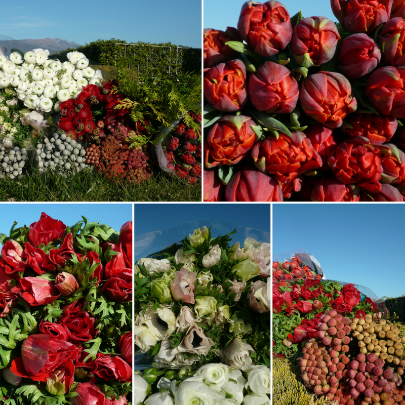
Intensive two day floral workshop in the countryside in Northern Italy. Two days with teorical lessons about design, palette, seasonal flowers. Pratice with the spiral, arranging flowers in a flower garden and a romantic and natural bouquet.A utumn flowers
Read MoreAn autumn wedding with an essential flower
An autumn wedding in the countryside amidst vinyeard. The swedish-english couple had a very clear idea of the style, the hues and the atmosphere that she wanted for their wedding. For the bride being passionate about flowers herself it was important that they played an important role on their special day. Going back to Paula’s wedding she chose a palette made up of different shades of bordeaux, burgundy, green and cream. A touch of light peach was added to give light and to create and edgy contrast. The chocolate hue of her moodboard conveyed elegance, smoothness and consistency.
Read MoreA JOURNAL OF THE INTENSIVE TWO-DAY WORKSHOP
An intensive two day floral workshop for beginner and people who are passionate about flowers. The course is structurated with theory and practice. Focus on flowers, style, season, design, conditioning, Practice with the spiral technique for a round bouquet, technique for a natural and romantic bouquet. Spring flowers
Read MoreA romantic shoot in the vineyards
A romantic inspirational wedding shoot in the vineyards, in Italy. Colours: the choice of the colour is the first thing to decide when planning floral decorations. I pinpointed two main colours: pink and green in different tones. Then I added a touch of burgundy and blue/violet to add intensity and give an edgy contrast to the decorations. Flowers: the texture of the petals and the shape of the buds are very important. It’s like with fabrics: there are different weights, weaves and materials. I’m always trying to create unusual combinations.
Read MoreHYGGE AND FLOWERS
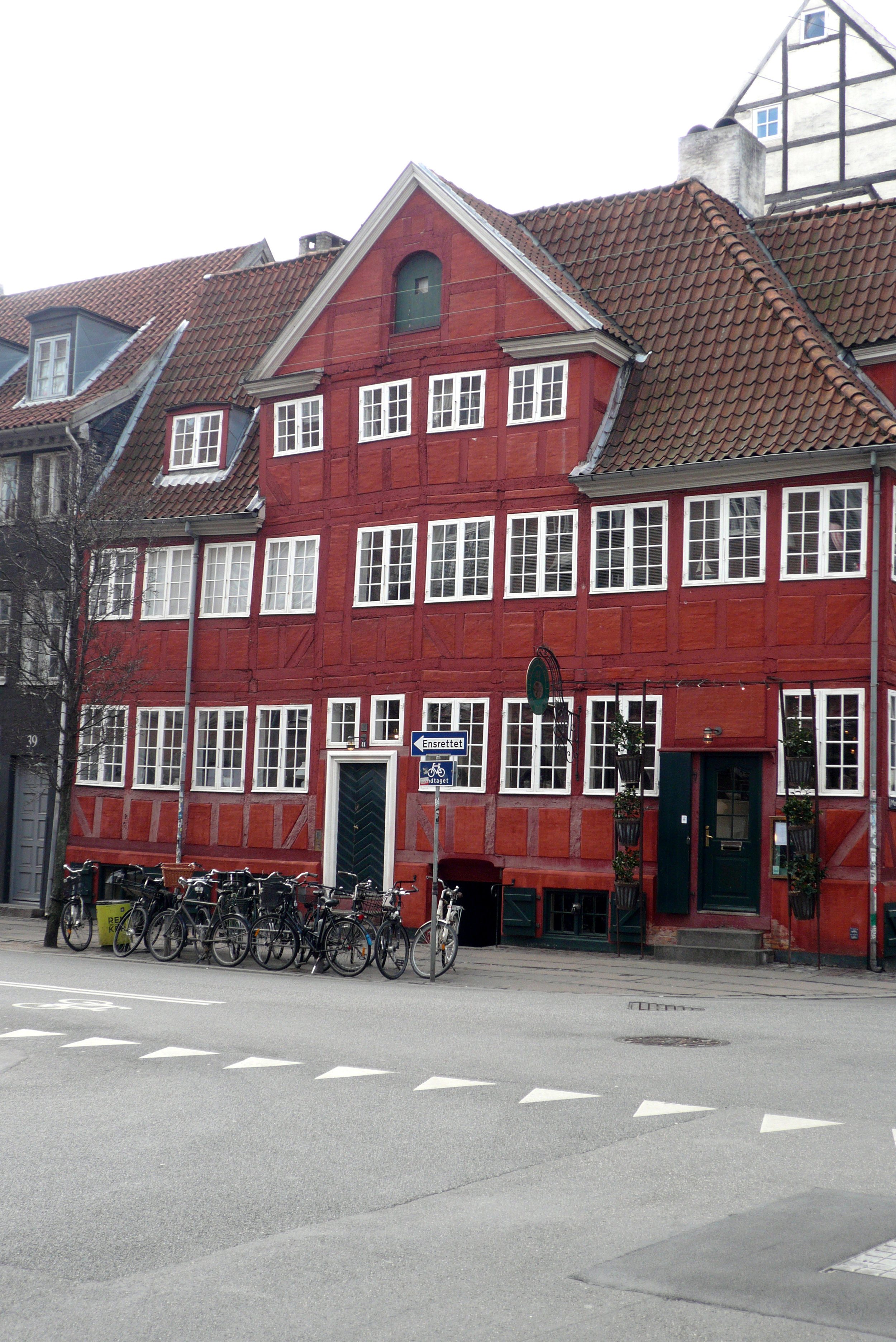
The Danish untranslatable word “Hygge” is the latest trend at the moment. What does it mean exactly? The meaning is more or less: “how to create a cosy and pleasant atmosphere, enjoying life with our loved ones.” Recently we were in Copenaghen and we felt this way of living everywhere. Upon our arrival we were impressed by the lack of noise and this calmness stayed with us all day long. A very relaxing and liveable city with an intense light and nature was very strongly present everywhere.
It was so inspiring for me. I could dedicate myself to the discovery of the Danish design (which I’ll be seeing again next week during the Milan design week).
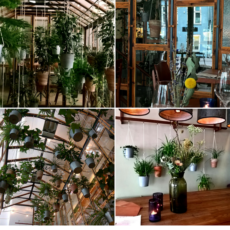
What impressed me most? The constant presence of flowers and plants. Flowers and plants everywhere: in vases, hanging from the ceiling, on tables and even decorating the plates. Everywhere you go from the small bar to the design store the attention to details is amazing.
A beautiful historic palace was the setting for the Danish design company of Hay House. We stepped into a world of hygge design and from the tall impressive windows we had an incredible view over the busy square.
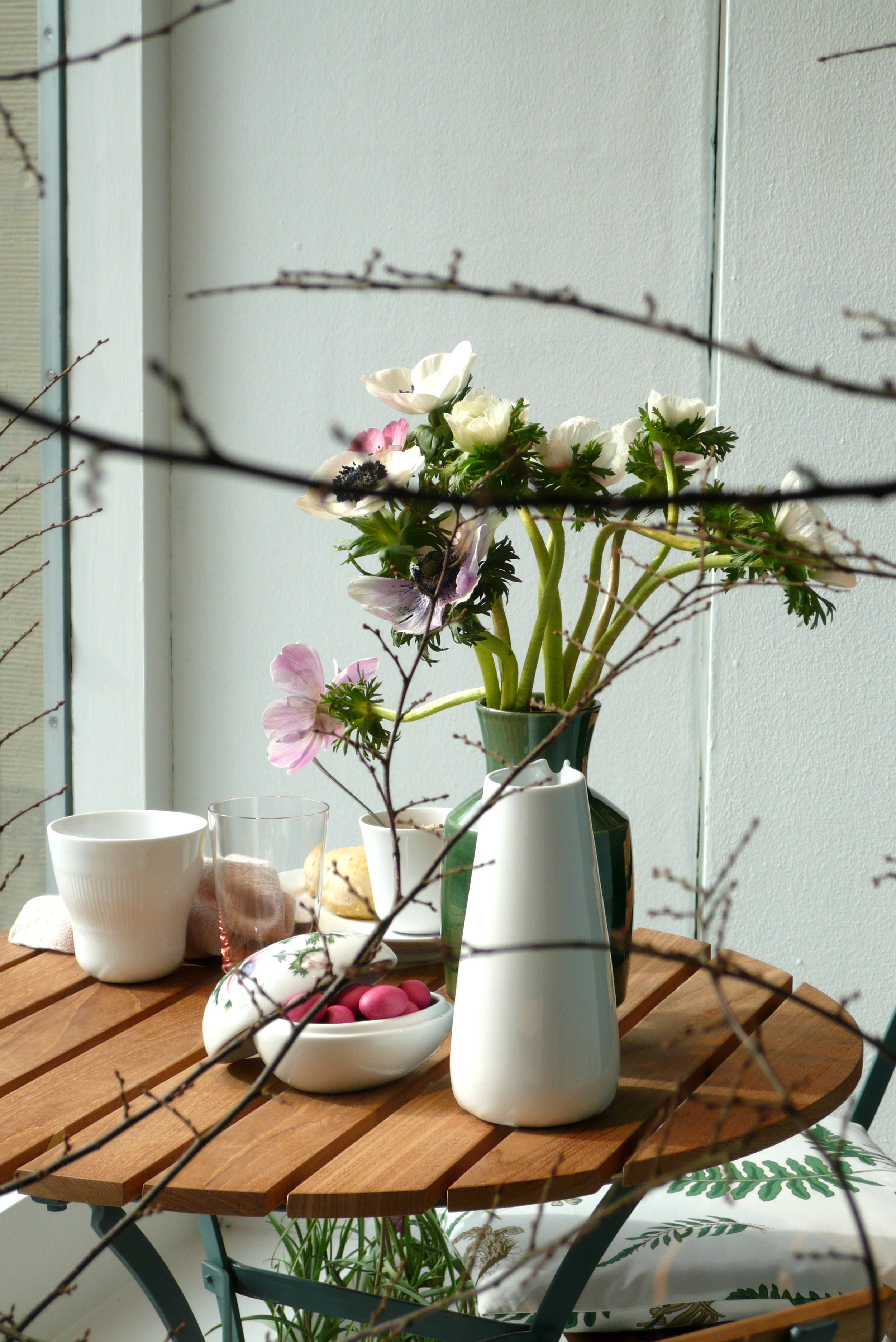
Next stop was the Royal Copenaghen store, one of the world’s oldest companies, established in 1775. Easter was the main theme with moss, trees, flowers, bulbs and fine china eggs in every corner.
Moving on we arrived in a quaint, little street home of the romantic and eclectic shop Stillleben.
From there we headed for lunch to a nice restaurant with an incredible inner greenhouse.
In the afternoon although the elements were against us, we popped over to The little mermaid on the sea. We stopped off at a coffee shop along the way to warm ourselves and to try a delicious Danish pastry.
Don’t miss my post next week about the Design Week in Milan.
A special thanks to Pauline of PetitePassaport for her very useful guide of Copenaghen.
an unusual Saturday in Berlin
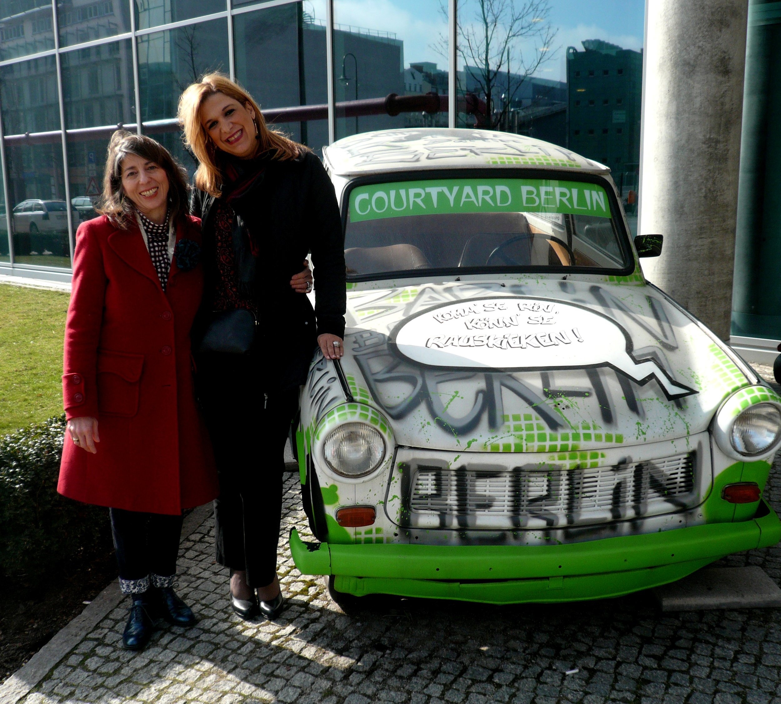
Destination Berlin to meet a very close friend for a 24 hour stay.
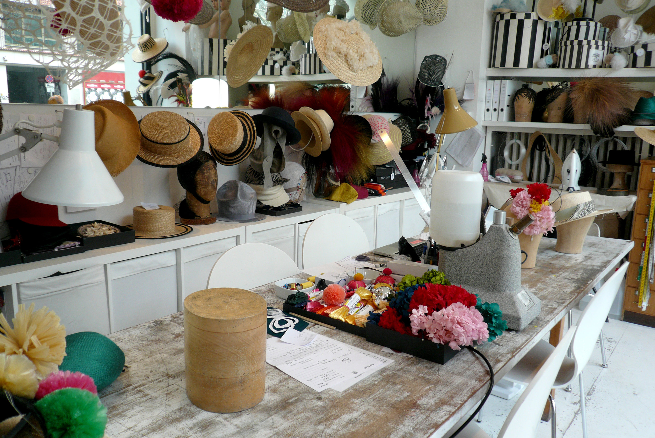
Two absolutely essential places to visit were Fiona Bennet’s hat laboratory and the Soho House Berlin space.
With Giselle, my dearest friend, I headed immediately to visit Fiona the “hatmaker”, who dresses many Berliners heads for every occasion. Stepping inside the shop, once an old soap factory, you enter a beguiling timeless world. A white fairy world where hat boxes, ribbons, little pearls, silk flowers and feathers vie for space and I just felt like Alice in Wonderland.
Pop next door, you find yourself in the future, in a space with mirrored and silver plated walls where colourful dresses, shoes and accessories are showcased.
After a well earned break in a cosy bar we took an unusual taxi, a 1963 Peugeot to the Soho House Berlin.
A two floor building with huge windows where modern and vintage is perfectly balanced. Inside the store you can find a barbershop, a florist, books, a coffee-shop, a corner with old vinyl records and of course the latest fashion. Dotted around the store are many little sofas and tables where you can stop and watch the world go by.
During my short but sweet Berlin stay I was pleasantly surprised to notice that everywhere was decorated with plants. In a nutshell the latest trend is definitely the Jungle urban style. Obviously there are always flowers to go with it!
discovering hellebore
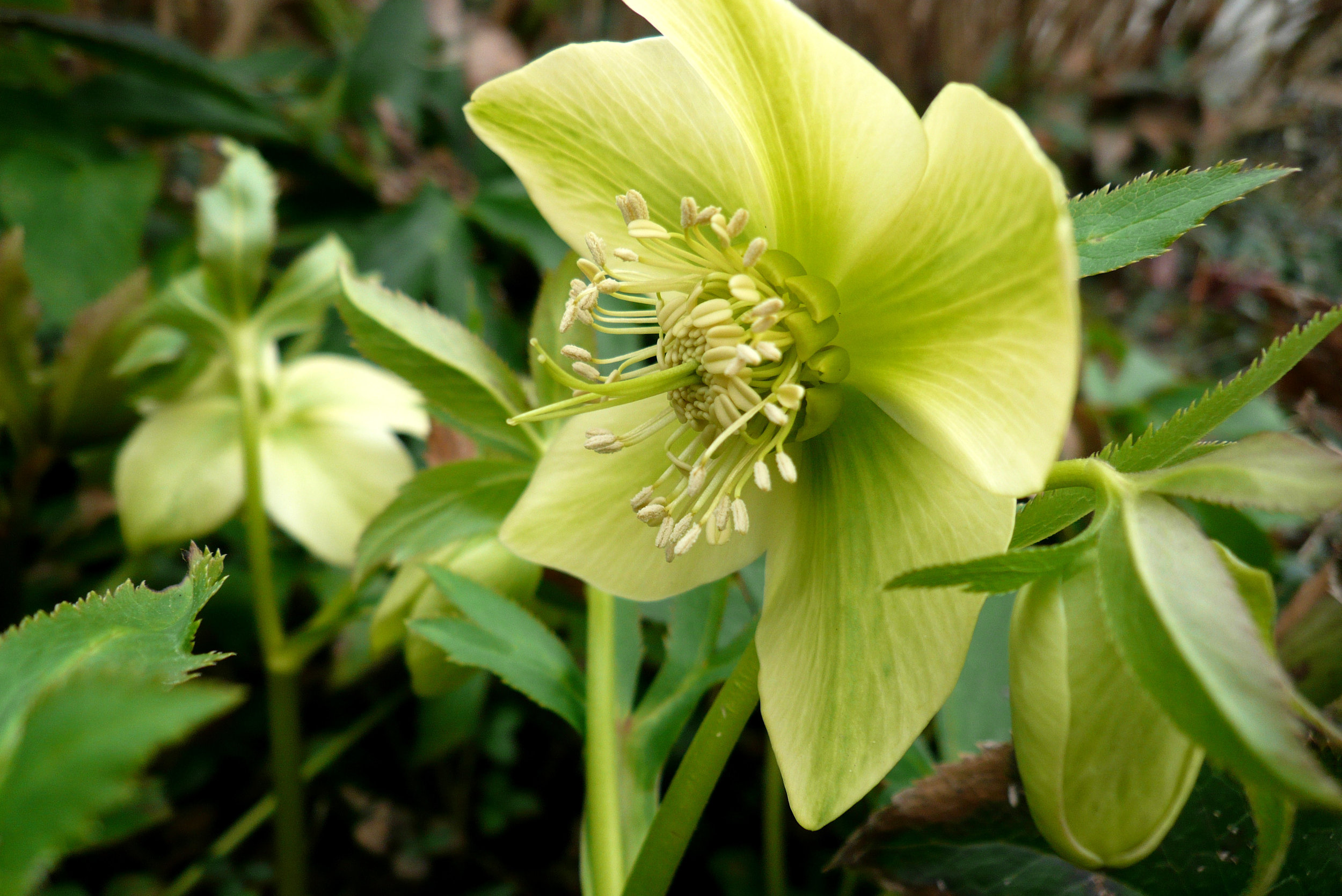
Today I’m going to tell you all about my morning with Laura the owner of “The Unsual Garden” where I had the pleasure of discovering new varieties of hellebore. I met Laura in September in Mantua where she was showing off her recent crop of tulip, daffodil and iris bulbs. I immediately bought some colorful tulips and daffodil and so now I can’t wait to see them bloom. In the last few months I’ve been keeping in touch with her in order to know when the hellebore was ready to blossom. Usually they start blossoming in December but this year it was delayed due to lack of rain and the intense cold. Finally the message arrived and so I jumped into the car and went to see her.
Twenty years ago Laura and two families bought a piece of land where they built their homes. They left the garden unfenced so as to enjoy the countryside at its best. On clear days they have an amazing view over lake Garda and the nearby mountains and it’s a haven of peace and tranquility.
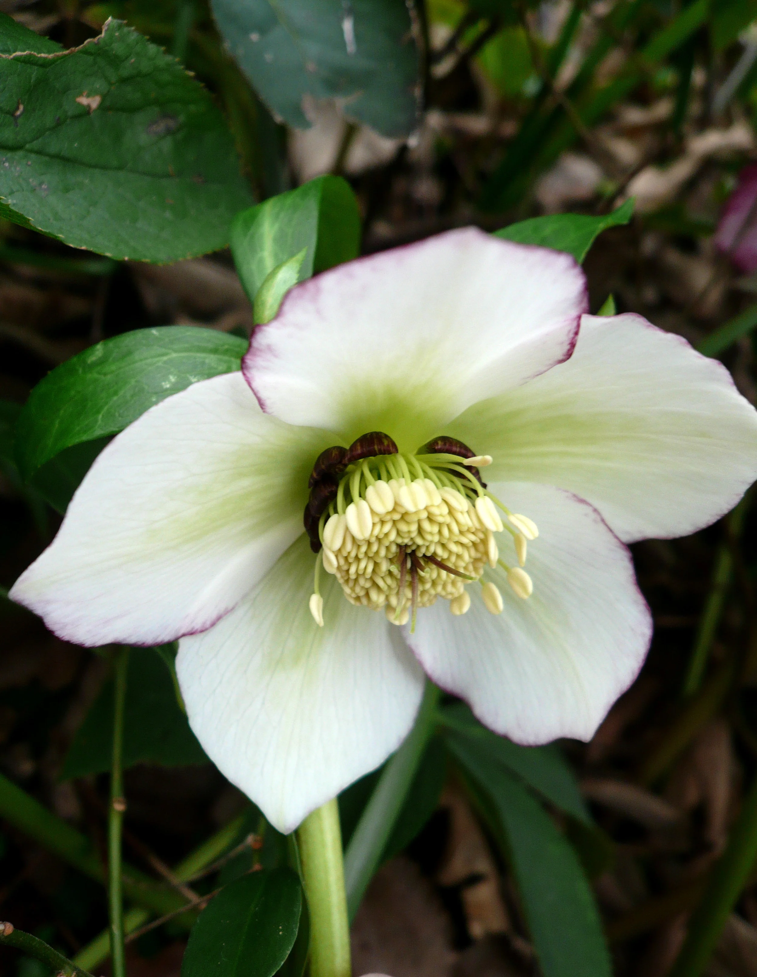
In spite of the greyish day, the garden had a magical atmosphere. I was immediately attracted to an impressive tree boasting tiny red apples and to delicate bunches of Viburnum dawn foresi. Laura was the perfect host accompanying me to explore her garden, pointing out the different varieties of hellebore scattered all over the garden. I even discovered some uncommon ones such as: hellebore picotee with delicate burgundy veining, a polka dot variety, a doubled petal one and even a blue one (I couldn’t resist buying one of the blue ones and I can’t wait to see it bloom).
Having spend a wonderful morning with Laura I’m anxious to return in April when the garden will be in full bloom.
Just a word about caring for your hellebore. It’s a hardy perennial, rustic plant and starts blooming at the beginning of winter until April. This plant likes half shade, and in April when it finishes blossoming it’s essential to keep it in the shade until autumn. In the Uk and northern America it‘s also known as the Christmas rose as it was traditionally used as a Christmas decoration. The most common variety is the Helleborus niger with its pure white flowers.
Hope you’re keeping busy in the garden as spring is on its way!
See you next time!
9 flowers to match the colour of the year
Greenery 15-343 colour of the year!
Each November Pantone Color Institute choose the colour which will influence fashion, design and weddings for the following year.
I love the motivation and definition that Pantone gave for this year’s choice: Greenery is a fresh and zesty yellow-green shade that evokes the first days of spring when nature’s greens revive, restore and renew. Illustrative of flourishing foliage and the lushness of the great outdoors, the fortifying attributes of Greenery signals consumers to take a deep breath, oxygenate and reinvigorate.
If you are going to get married this year, Greenery will be very easy to add to your moodboard. You could either choose just a green palette or add it to the other colours. In addition to the classical and timeless white and green combination, there are many other possibilities: take a look at this link.
Talking about flowers, there is quite a choice, here are some that have interesting shades of green:
- Carnation “prado”, annual
- Light green eustoma, best time spring &summer
- Rose from Ecquador, annual
- Light green hydrangea, spring&summer
- Chrysanthemum “froggy”, annual
- Snowball, May
- St. John’s Wort green, annual
- Alchemilla, annualAmni, spring&summer
- Blue throatwort, annual
- Dianthus tricky, annual
Finally green is perfect for any style you choose for your wedding: from modern to romantic, from elegant to natural.
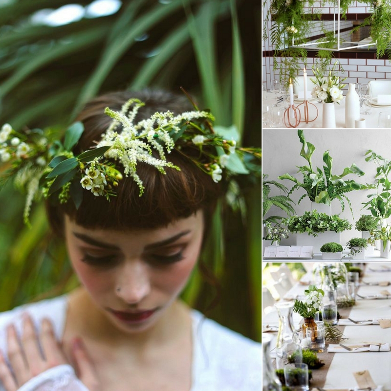
Have a look at the moodboard I created to get some inspiration. Have you already decided about your wedding moodboard? Tell me about your choices.
a December wedding
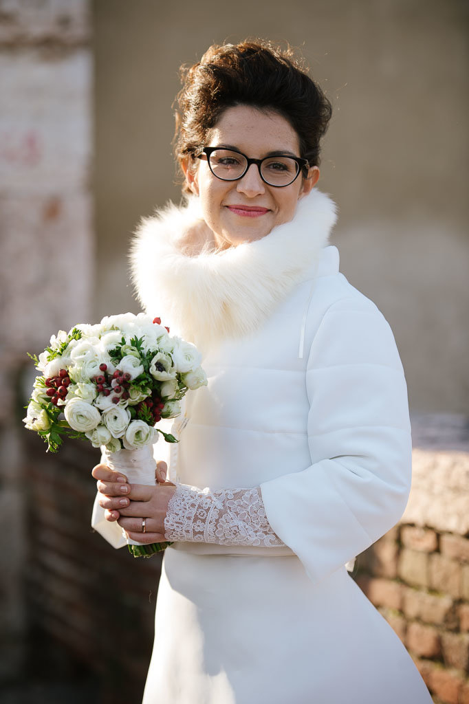
The photos speak for themselves, it was the wonderful winter wedding of Chiara and Alessio. As you can see the bride was radiant, sweet and romantic.
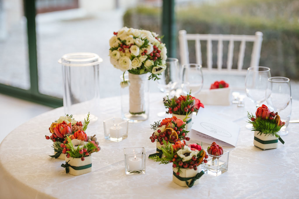
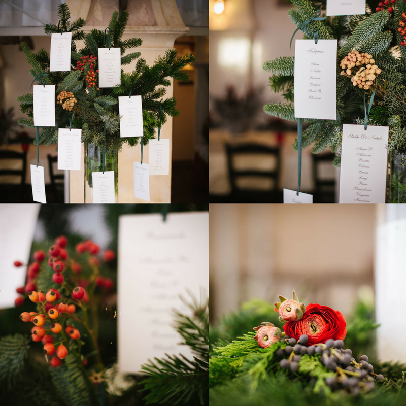
Chiara and I met for the first time in spring. During our meeting she expressed the desire to use red as the main colour for their day. So the floral moodboard I proposed was: white and red anemones, double red tulips, white and red ranunculus, berries, small apples, dried oranges, rosehips, silver pine, Norway pine, silver and green cypress.
Chiara chose the beautiful church of St. Zeno in Verona for her special day. It boasts many beautiful and opulent frescos, in particular the magnificent Mantegna altarpiece by one of the most famous Italian Renaissance painters. I suggested a neutral palette for the floral decorations white, different shades of green and silvery-grey. These colours enhanced both the beauty of the church and flowers.
With a snow white bridal gown it was essential a touch of red. Red rosehips were added to pure white anemones, ranunculus and small white rose buds. With a touch of red lipstick the bride was ready.
Bright red took center stage throughout the decorations: from the place setting to the centerpiece, right down to the wedding cake decoration. For each table I created colorful floral compositions wrapped in soft white linen and for the bride&groom’s table there were some small “floral cakes”. For each guest there was a small pine branch with a little red apple, and a cascade of red flowers for the wedding cake.
I would like to thank Chiara, Alessio and Paolo (the photographer) once again for letting me share their unique day.
anemones
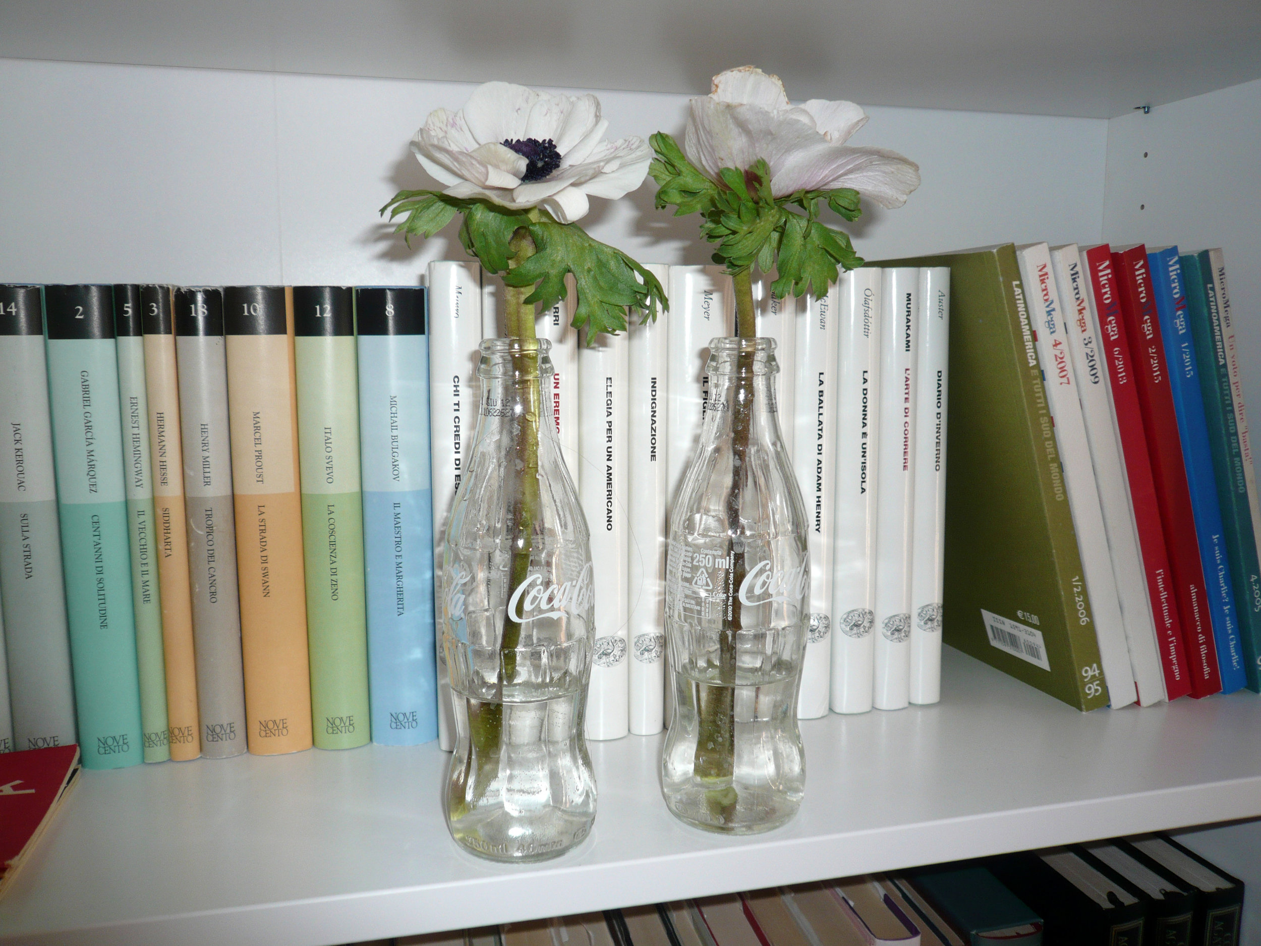
In the winter flower gallery let us spare some time to better get acquainted with anemones. You’ll learn to love this graceful flower little by little. Anemones are so unpretentious and shy, always huddled together with their blossoms tightly closed as though they’re hiding a secret.
Once you buy them you need to arm yourself with plenty of patience. They will slowly reveal themselves like dancers doing pirouettes in light voile skirts. As the blossoms open up, they finally show off their dramatic black centre surrounded by bright coloured petals. We are spoilt for choice with all the variety of colours. From pure white, ideal for a winter bouquet to vivid red, perfect for Christmas and St. Valentine’s, right down to timeless elegant burgundy.
Here are some practical tips for caring for your anemones:
- the hollow stems are very delicate so handle them carefully
- they don’t need a lot of water (maximum 5 cm)
- they’ll grow so keep this in mind when creating your floral arrangement
- buy them at least 3 days before making your floral arrangement
I came across these photos of anemones and I was fascinated by them. This shots were taken by Jessica a Californian floral designer, who revealed that anemones are her favourite flowers. I think she managed to capture all their beauty, what do you think?
Which are your favourite winter flower? Let me know!
festive flowers for your Christmas table
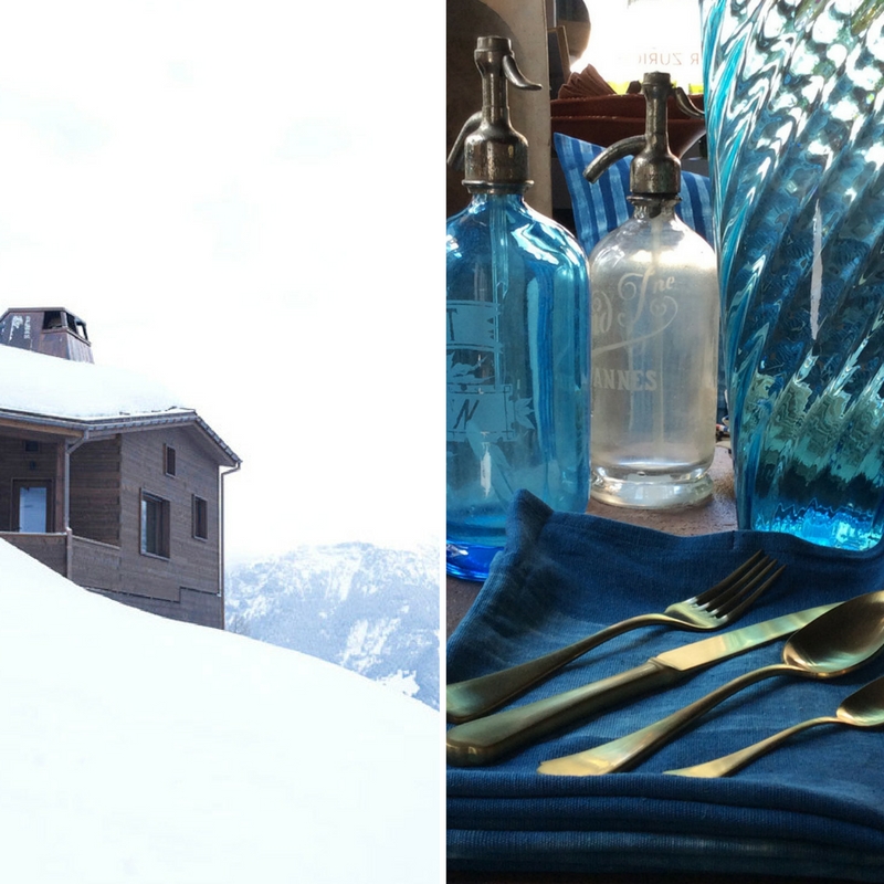
To create an elegant Christmas table I was inspired by this blue tableware from the designer store Froh & Sinn in Zurich. I suggest a welcome floral arrangement in a light blue vase if possible, 3 bouquets of white roses for your centrepiece and a small bouquet for each guest placed on a blue napkin. Add a cozy atmosphere lots of snow and candlelight for some true festive spirit.
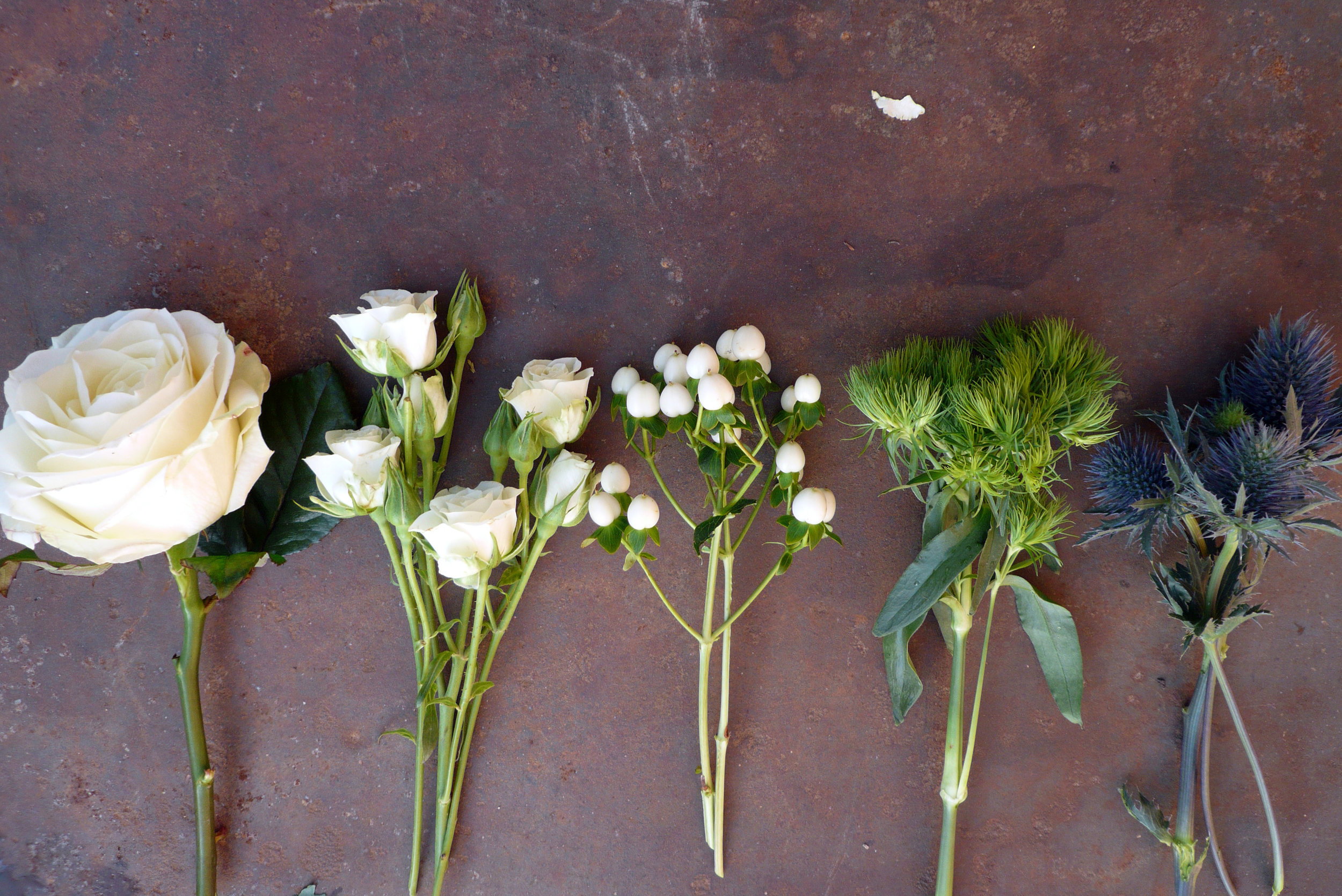
For the welcome floral arrangement, you will need:
- 1 medium branch of Norway pine
- 1 medium branch of silver pine
- 2 small branches of cypress with pine cones
- 2 berries of silver brunia
- 2 berries of white St. John’s Wort
- 1 stem of blue Sea Holly
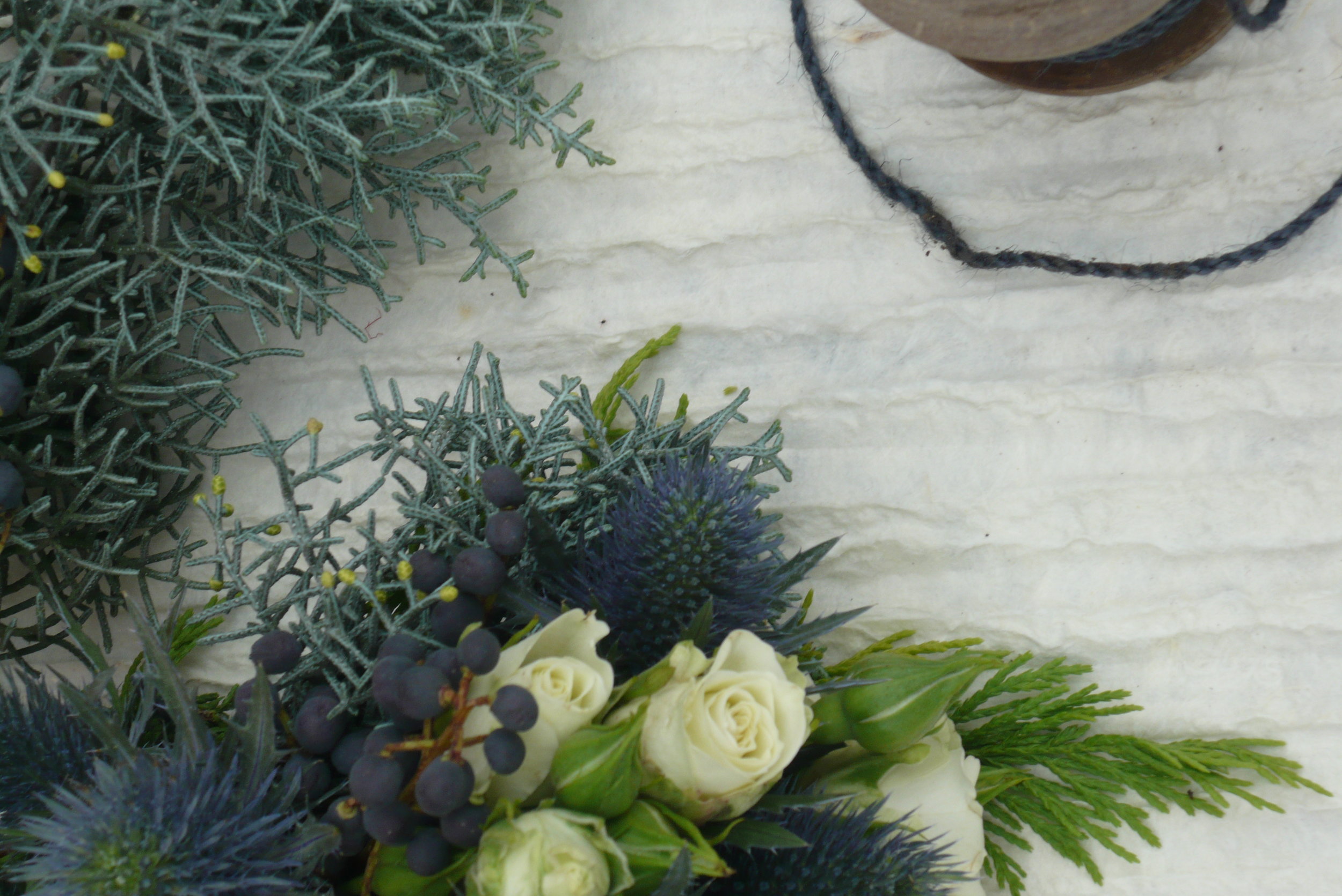
Start with 2 slightly overlapping big branches, add some silver cypress at different heights and finish with a bunch of berries on the front. To add some sparkle thread a string of led lights among the branches.
For the rose bouquets, you will need:
- 6 stems of fully blossomed white roses
- spruce (as much as you may need)
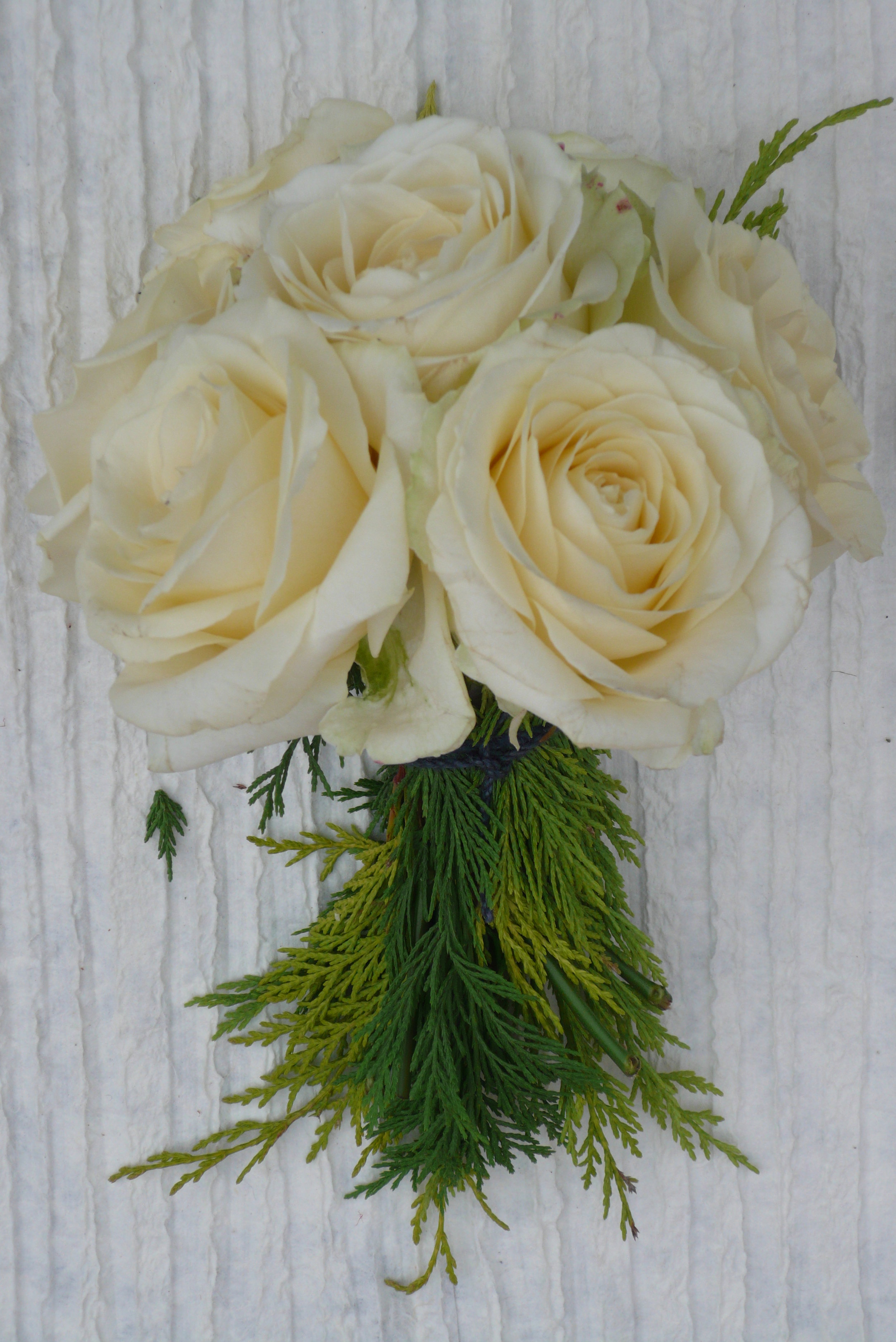
First remove all the leaves from each stem and create your bouquet using the criss-cross technique (have a look at the video in the link). Finally cover all the stems with small branches of spruce that you prepared earlier and tie with a ribbon.
If you need some more tips for decorating your Christmas table please send me an e-mail, I’ll be happy to answer you. I look forward to seeing your creations!
If you want to brush up on your flower arranging skills or even give a workshop as a gift, don’t hesitate to contact me. Remember my workshops are open to everyone no matter what your level, just the only essential ingredient is passion!
Don’t forget my next workshop will be just before St. Valentine to help you create a special bouquet (see link for details).
I wish you all a wonderful Christmas and see you in January 2017!
inspiring home decorations
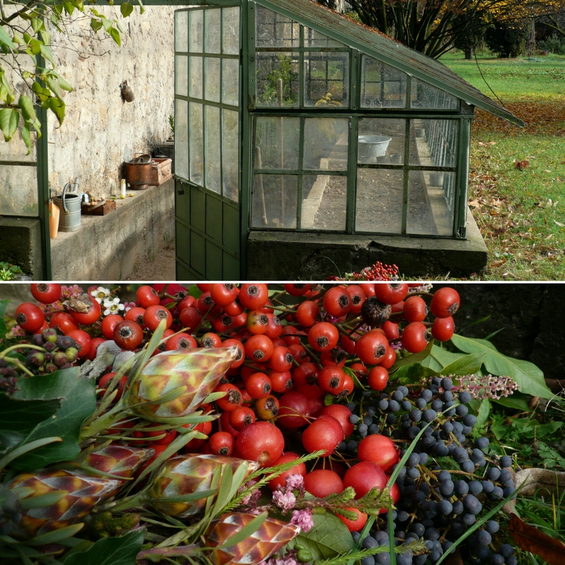
Last Saturday I found inspiration in the beautiful greenhouse of Villa la Valverde. I started choosing the flowers and vases to use in the decorations the day before.
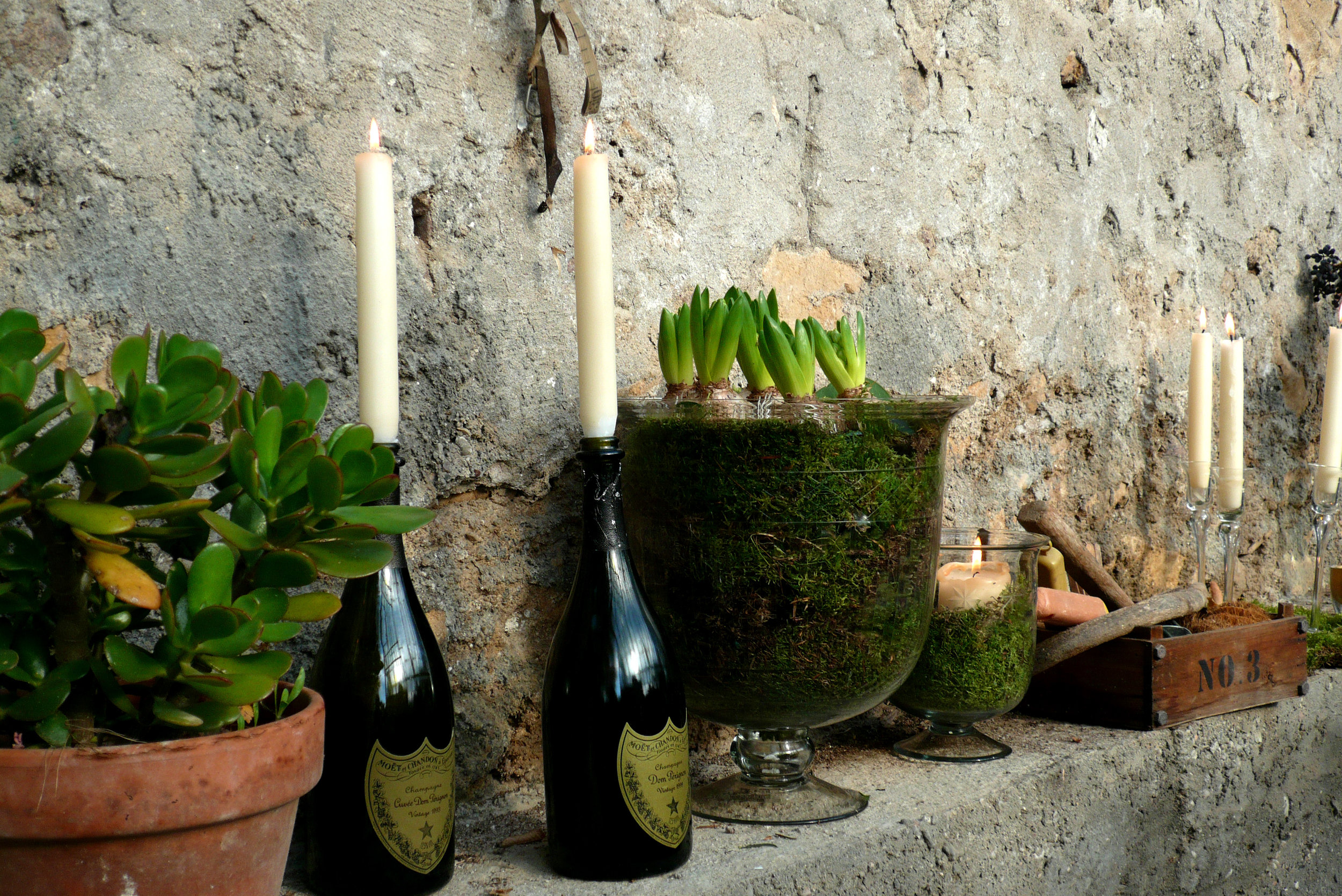
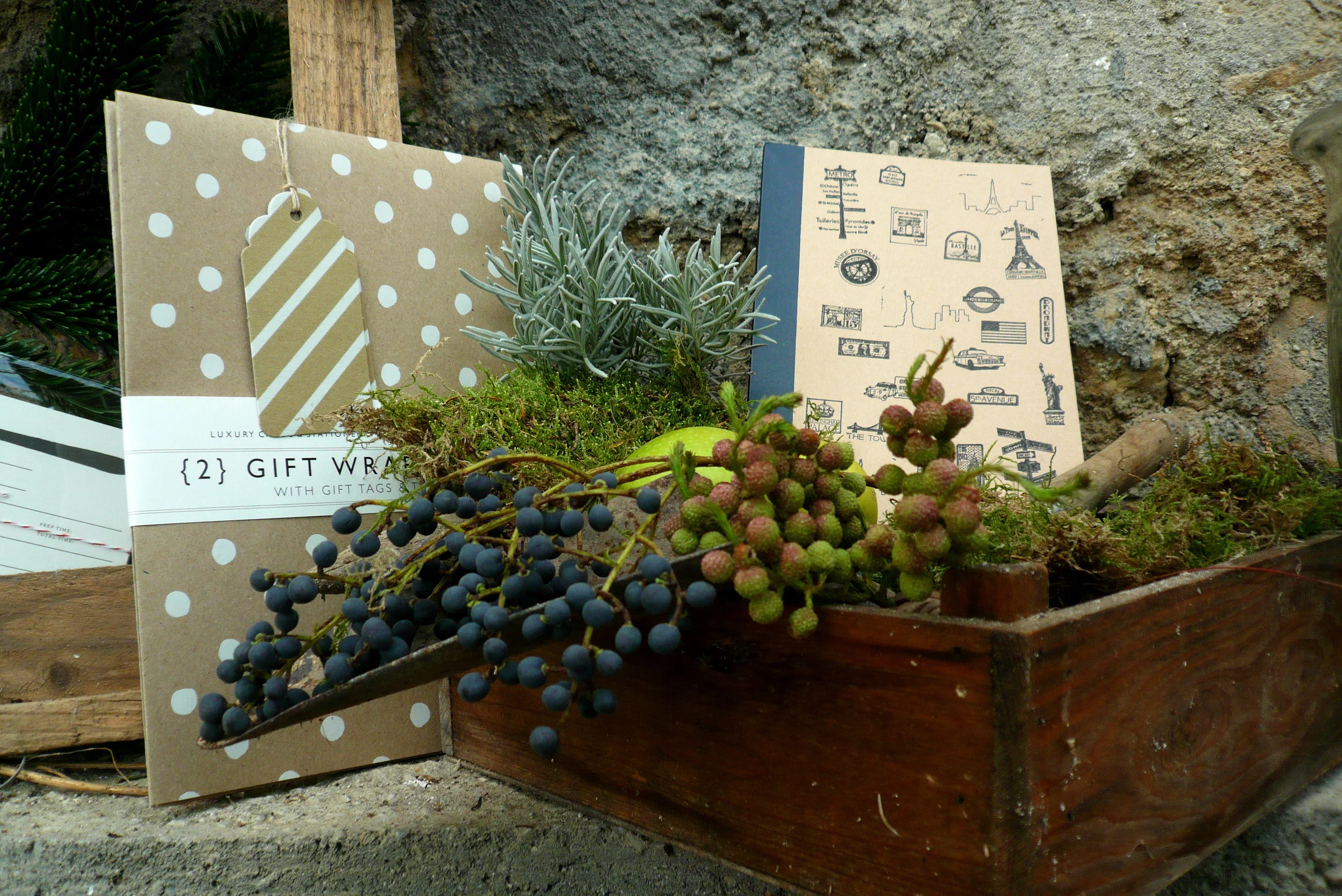
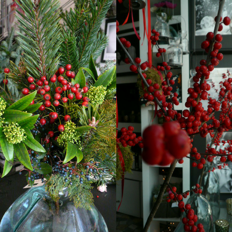
I combined a range of different berries with Norway pine, moss and hyacinth bulbs. Berries are an absolute must for any Christmas decoration for their amazing colours and textures. I decided to resume a Swedish Christmas tradition. In December in Sweden all homes have bulbs and when the flowers blossom, the scent spreads through every room. Bulbs are very easy to take care of. You need to water the bulb and the flower every 3 to 4 days. When kept indoors they blossom after 10 days. When the flowers wither, cut the leaves and the flower and store them in a paper bag in a dark, dry place. You’ll be able to plant them either inside or out next year.
As you can see from the photos, I used different types of bottles, small vases and other things that I found in the greenhouse to create interest. Always try to use at least 3 elements and dare to be different by making unusual combinations. For examples I put a succulent in a simple pottery pot together with an old wooden tool box which gave an unusual twist.
Don’t miss my next post about Christmas table decorations!
Have you put your decorations up yet? Send me your photos!
Notebooks and gift wraps from Lino’s & Co.
ideas for decorating your home at Christmas
In the last few days I’ve been checking out the latest Christmas decorations. Out of the many Christmas images I was always attracted to a natural and cozy atmosphere.
Let’s start with some useful tips:
- As I wrote in my last post, do start by choosing your colour palette (maximum 3) and the style you desire to have in your home. These two tips will make it easier for you to focus on what you like best and how to make it. (Do take a look at what you have at your disposal)
- Do use a lot of candles, they help a lot to create a warm atmosphere.
- Do try to decorate all your home so each room will look festive
By the way the official date to start all Christmas decorations is the 8th of December, but we can start them a little bit earlier to make the magic last longer!
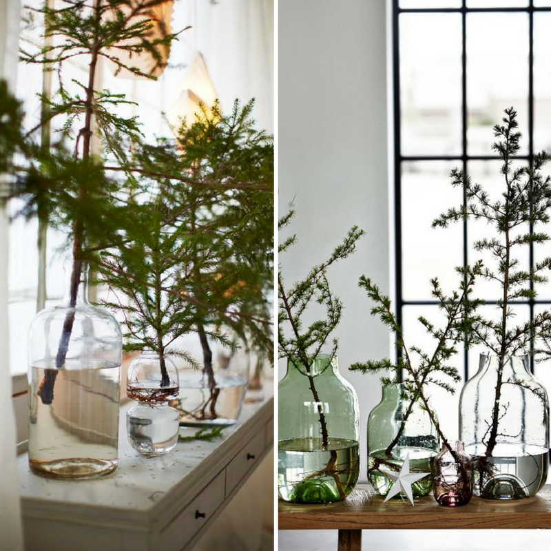
I love to use what nature offers in this season, so I’ll give you a list of foliage that you can buy at the local florist or find in the woods
Pine
Pine is the king of this season. In the shops, you may find two different varieties that don’t lose needles and last for all the period: Norway pine (bottle green colour) and silver pine (silver green). Not forgetting the very perfumed strobus pine.
Cypress
Silver and green cypress branches always remind me of vintage lace and will add an unusual twist.
Eucalyptus
When dried, eucalyptus silver green leaves change to an ash grey colour. I personally love the silver berried eucalyptus as they look like little fireworks when blossoming.
Berries
You’ll be spoiled for choice with berries: from pillar box red right down to a wide range of browns and burgundies.
Moss
Moss is an absolute must for any festive occasion. Its softness will add a fairy magic to your home!
Here are some photos of easy and interesting things to make.
In a nutshell try to use different kinds of foliage to add texture to your creations. And don’t forget a splash of colour!
Do you find this post helpful? Send me your feedback and photos about your creations.
Some pics are mine, other from Pinterest!
4 essential floral design rules to create yours decorations
As Christmas time is approaching, I would like to share with you 4 essential floral design rules which can be very useful for decorating the Christmas dinner table or even for a birthday party or a wedding.
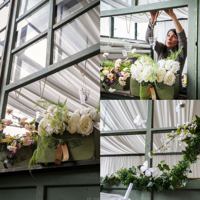
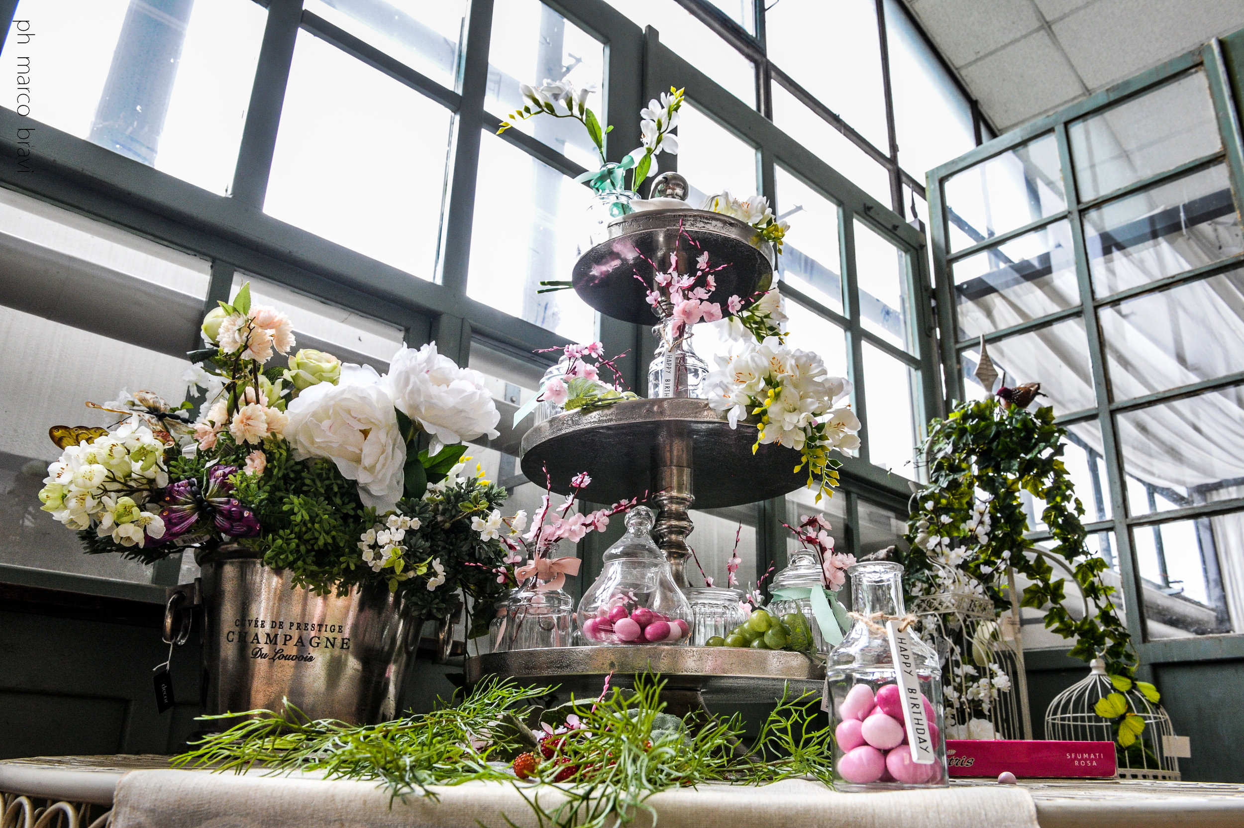
To show you what I mean let’s take an example of a creation I made in February. The task was to create a complete inspirational scenery for a wedding setting.
1. COLOUR
The first rule is to choose a colour or a palette of colours (my advice maximum 3). It will be then easier to make all the other choices. Possible colour combinations can be based on tones, contrasting colours or even neighbouring colours on the colour wheel.
For this particular work I chose a delicate pink and white palette with neutral green as a base. Be careful not to gather too many colours as there is no place for the eye to rest.
2. MOODBOARD
It’s essential to create a moodboard in order to find out your tastes, ideas and style. Different types of magazines are great for providing inspiration. Pinterest is fantastic for helping you wrap up your ideas. The important thing is to go with the flow and not have too many preconceptions. Have a look at my Christmas board on Pinterest.
3. LESS IS MORE
It’s important to keep in mind the location and what is at your disposal. Remember to keep it well balanced and don’t go overboard: less is more. Try to focus your attention on one element which could be either the flowers, the tablecloth colour or the place setting, the others elements will be the backdrop.
4. CONTEXTUALIZE
Always keep in mind where you are going to do your creation, the colours that are already there, the interior design, the style and what you have. For example, for your wedding if you’ve already chosen the location, the style of all the floral decorations has to be in harmony with the setting.
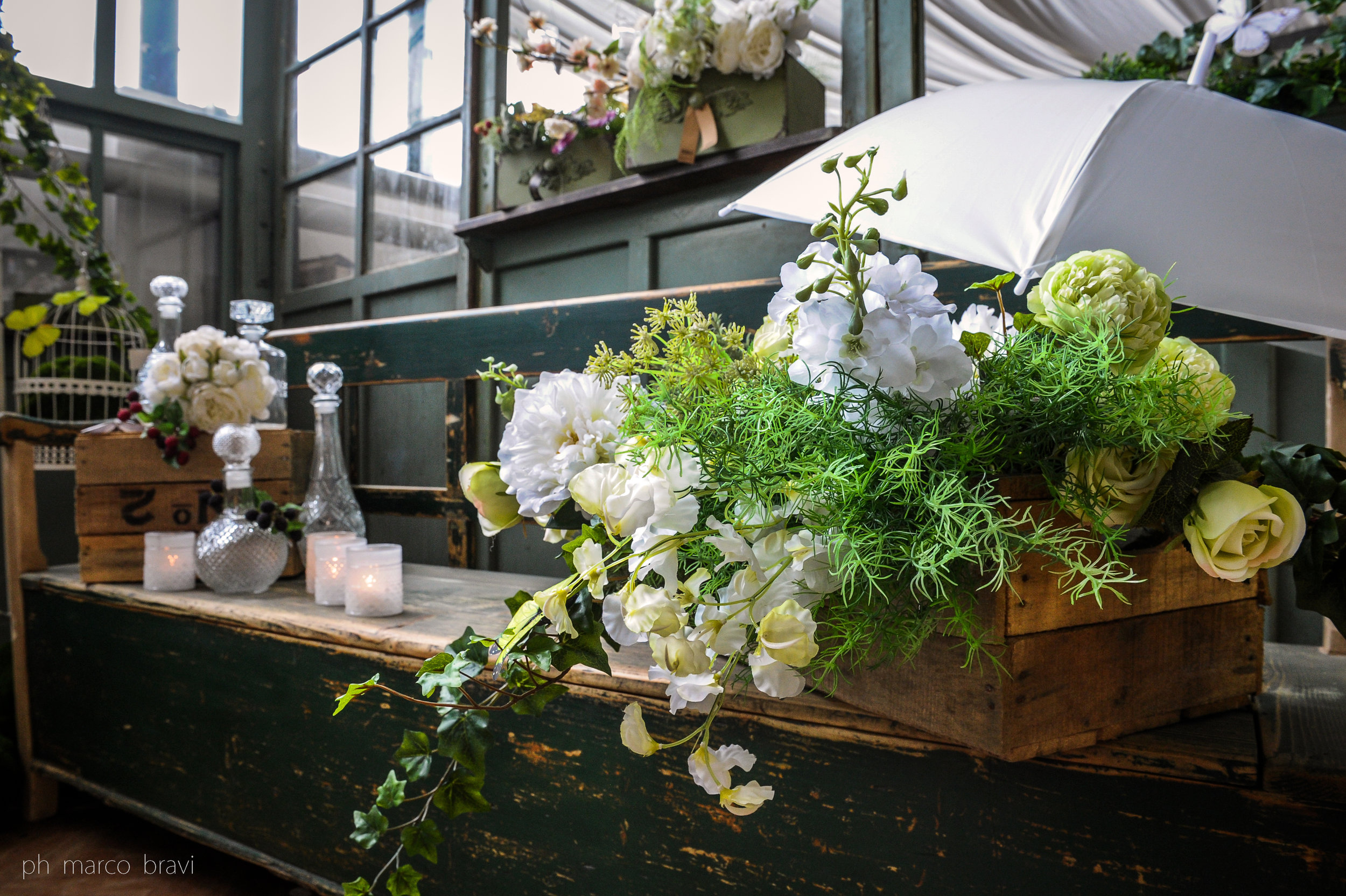
Just going back to the scene I created in February my starting point for every single choice was a big glass wall. I imagined it to be a corner of a country winter garden, so the style was romantic with a vintage accent.
In a nutshell, always follow these rules whether it to be a dinner with friends, a photo shoot or any special event.
In the next post I’ll be giving you some ideas on how to decorate your home for Christmas.
Let me know what you think!
The location and all materials are from Ambroso.
Marco Bravi was the photographer.
journal of a winter wedding
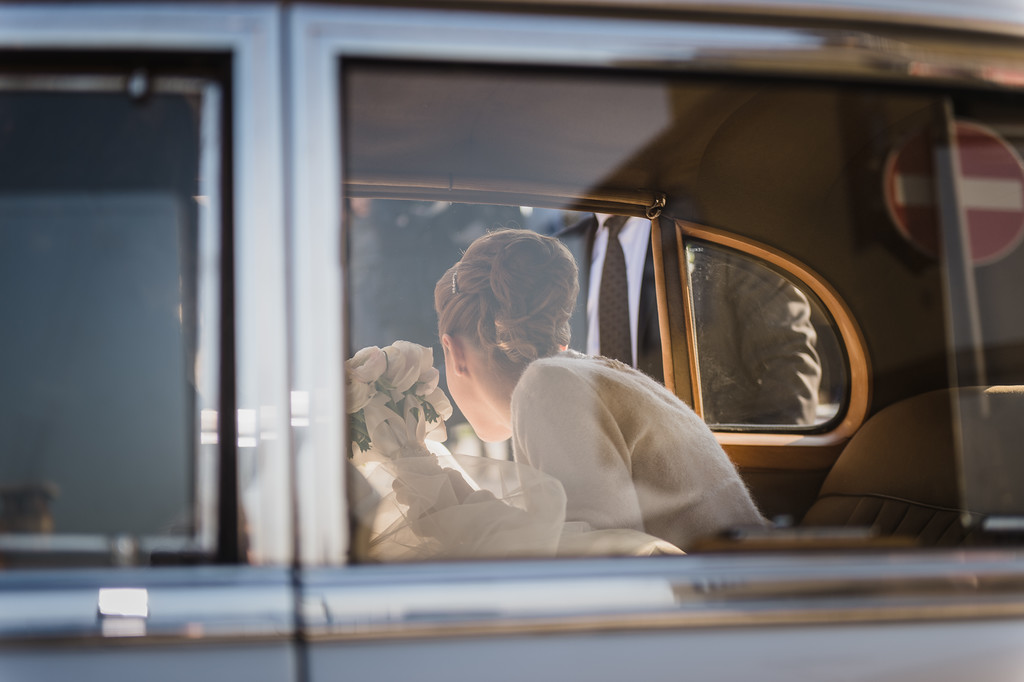
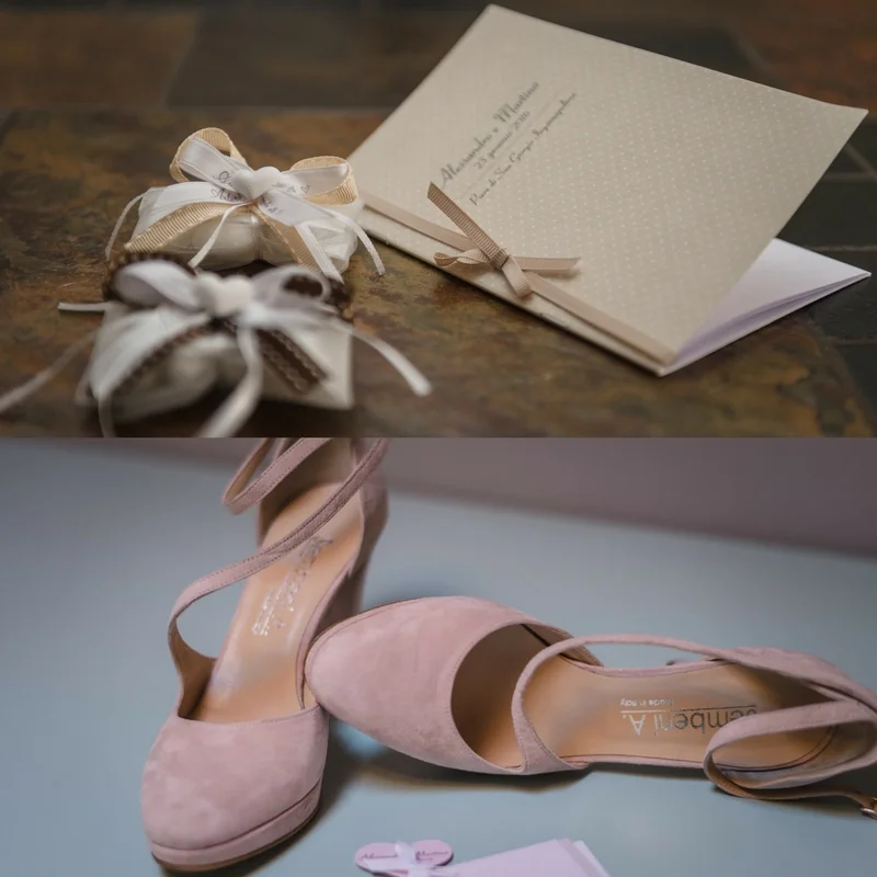
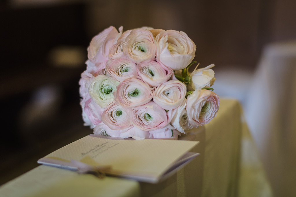
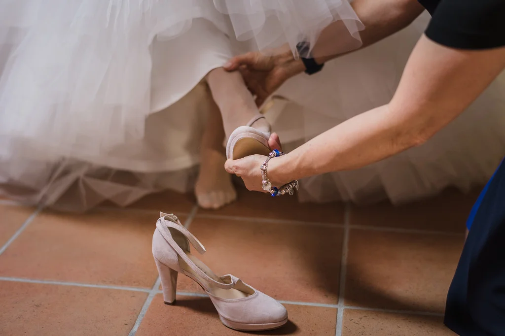
Today I want to tell you about Martina and Alessandro, a young sweet couple who got married in January. Their desire was to have an elegant, romantic wedding in the delicate tones of white and light pink. Light pink was the main colour of their day: from the invitation cards, the party favors, right dowun to the bride’s shoes...
THE CHURCH
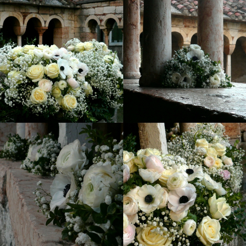
The romanesque parish church of San Giorgio Ingannapoltron was chosen, which was located in the beautiful wine area of Valpolicella. From the little churchyard, there was a stunning view of Lake Garda. The church itself with its little cloister is built from local stone and has a clear cut design. The couple wanted the floral decorations to be soft and graceful. I suggested flowers with a roundish corolla. The traditional winter flowers anemones and ranunculus were perfectly matched with the elegance of white roses and the softness of baby’s wreath. Seeing als Christmas wasn’t very far away I decided to choose dark green buxus to use in all the creations.
THE BRIDAL BOUQUET
Martina, picked a very romantic wedding gown with an ample tulle skirt. The perfect choice of flower for her bridal bouquet was light pink cloni ranunculus. The cloni ranunculus started to become popular a few years ago and is an absolute must for a winter weddings. This particular flower has all the elegance of an English garden rose and the beauty of a peony. The older they get the more beautiful they become; the blossom opens up more and more to reveal their silken petals.
WINTER FLOWERS
Just another word about anemones and ranunculus. Anemones are effervescent flowers with their black centres and the their delicate silk like petals. You’ll be spoiled for choice by the vast array of colours to choose from. Pillar box red to deep burgundy and right down to every shade of purple. There is a lot to write about ranunculus check out my blog for more information about varieties and colours.
Which flower do you go for in winter? Drop me a line and let me know!
A special thanks to Martina and Alessandro and to Sergio Sarnicola the photographer for his outstanding work. (Some of the photos are mine which I took during the preparation)
a journal on our two-day workshop
During the first week-end in July I organized a floral intensive workshop. Two days fully immersed in the floral world. The main objective was to give the theoretical and practical know how to get started in the art of floral design.
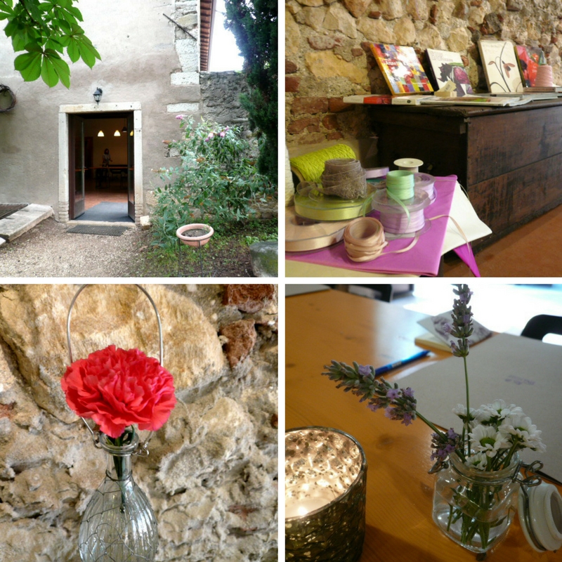
The course was held in the amazing Villa La Valverde a country house set in the nearby Verona countryside.
While I was preparing the course and deciding which flowers to use I realized that the essential element was colour. On Saturday the floral arrangements were: a classical, white bouquet of roses and a floral garden composition. While doing the classical one the group learned the basic criss-cross technique useful for the creation of all kinds of bouquets. For the floral arrangement in sponge I focused on different shades of pink.
On Sunday we started with the creation of a natural, yet romantic bouquet and a floral arrangement with flowers, fruit and vegetables. For the natural bouquet I chose flowers which aren’t often used together with contrasting colours to give it an edge. The floral arrangement in sponge was made using different shapes and materials styled together with the flowers.
It always amazes me how each of us expresses ourselves through flowers. There can be flowers that we love more, colours which don’t resonate with us, materials and shapes with which we are more comfortable. The whole journey is a continuous discovery and also a chance to get out of our comfort zone.
Over the two days while chatting over a coffee we got to know each other better and shared our ideas.
At the end of the course, everyone proudly took home not only their beautiful arrangements but a wealth of information. Throughout this intensive experience, I also learned a lot. It was a pleasure and a privilege to accompany these passionate and motivated people trough this magical and marvelous world.
flowers for an intimate wedding
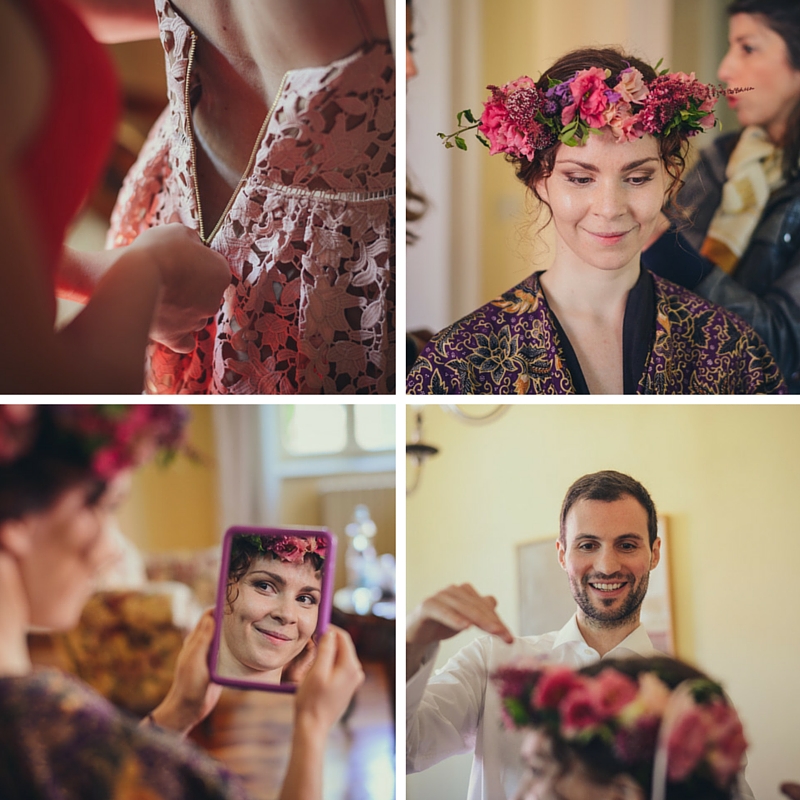
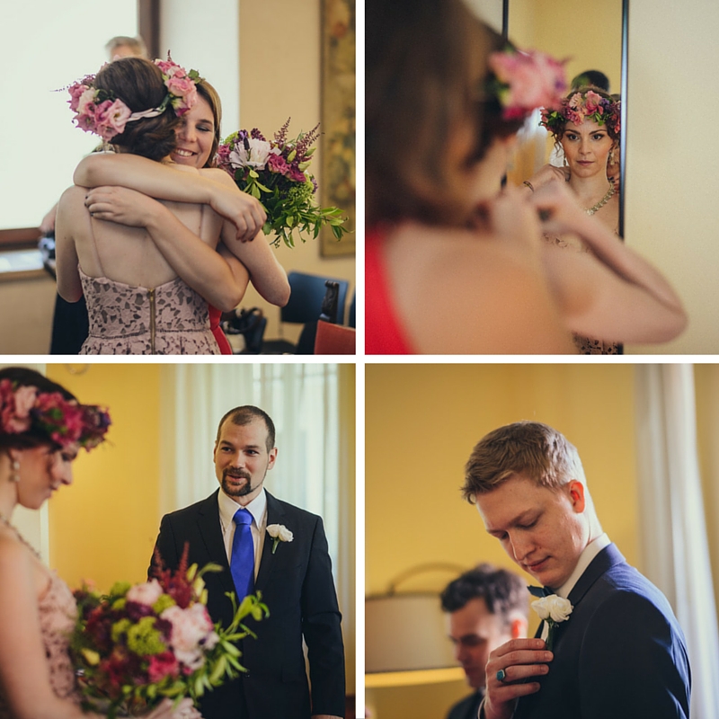
An intimate wedding on a bright May day. Matanja and Anton, a young German couple decided to get married here in Verona and, asked me to do all the floral arrangements. A blissful carefree wedding in the company of a few close friends and relatives.
Beforehand Matanja and I had a nice chat about style, flowers and colours. The couple wanted a very small and romantic wedding. They also wanted it to be informal but with a special attention to detail. Matanja adored all shades of punk from the most dramtic tone to the most delicate one. A dash of mauve and a touch of light green completed here moodboard. May with its huge variety of flowers was the perfect month to fulfil her wish. Peonies in two shades of pink took pride of place in the arrangement. These were complemented by syringa lills with its elegant hint of mauve, lavender, ligh green viburnum, depp pink alstilbe, light pink eustoma and an outstanding purple scabiosa. It was a striking but well balanced combination.
The flowers had to make every place special and unforgettable:from the romatic villa, Juliet’s tomb whre the ceremony was taking place and the Piazza for the aperitifs.
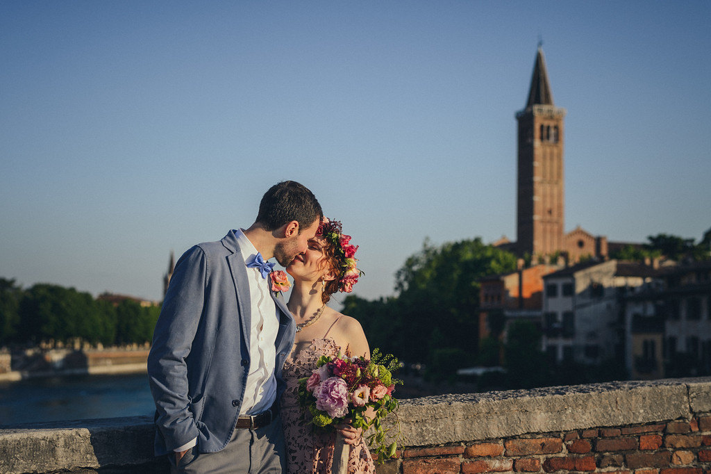
In keeping with the wedding I created all the arrangements in a natural yet elegant style. The pale pink of Matanja’s short lace dress was the perfect contrast to deep purple of her head wreath and bouquet.
The flowers had to make every place special and unforgettable:from the romatic villa, Juliet’s tomb whre the ceremony was taking place and the Piazza for the aperitifs.
The wedding day.
Upon my arrival at the villa I was immediately immerses in a relaxed and happy atmosphere. Everybody was getting ready maidt laughter and music.
At 10 o’colock the couple and their guests strolled down the road to Juliet’s tomb. After a short moving ceremony the couple walked through to the intimate courtyard where tey were greeted with bubbles and joy.
Verona is the perfect backdrop for a dream wedding.
Its locations include stunning Ponte Pietra, lively Piazza delle Erbe and the elegant Giusti’s garden to name but a few.
A special thenks to Sergio Sarnicola for his wonderful pictures.
floral arrangements for an event in Villa Allegrini
Every spring the Valpolicella area famous for its amazing wines comes alive for the Vinitaly wine exhibition. I was asked by the prestigious Allegrini Estates to create all the floral arrangements for the event.
During the Vinitaly exhibition Allegrini was presenting their new label for their La Grola red wine. The inspiration for the label was the “Composition VI” of Kandinsky painting. The floral installations were going to be the background for both the stand and the soirees at Villa Allegrini. Looking at the Kandinsky painting I let myself be transported and chose two colour palettes based on red and pink.
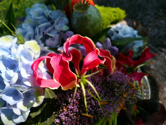
I used the effervescent and energetic red pallet to create a positive vibe at the stand. The Gloriosa Rotschild was an absolute showstopper. For the elegant, stylish evenings at the villa the pale, feminine pink “Quicksand” rose added a delicate and timeless touch.
The spring flowers of ranunculus in a variety of shades and multiple varieties of tulips and anemones held the supporting role in this beautiful creation.
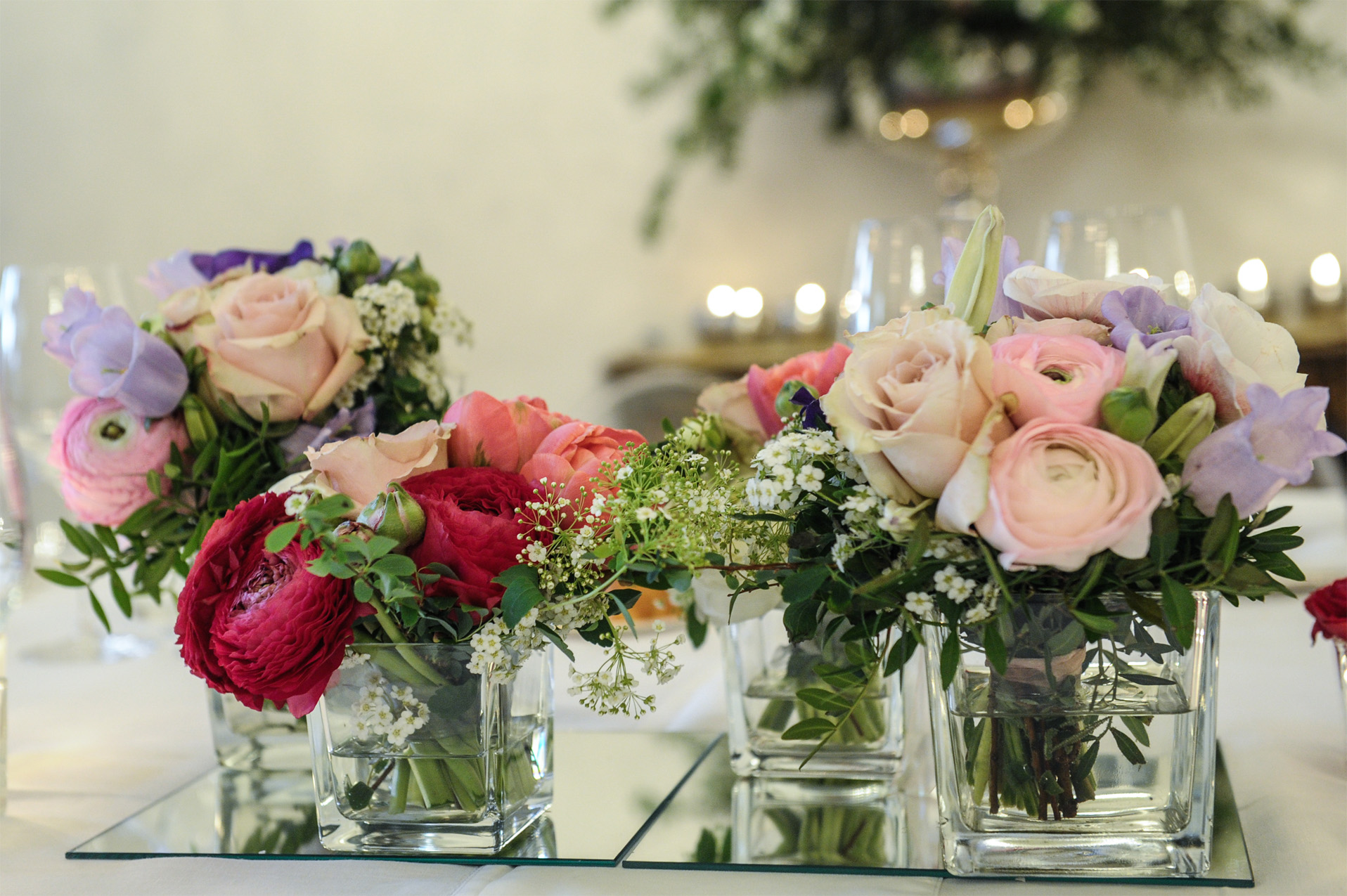
To highlight the beauty and style of the flowers in the Villa I used transparent glass vases, candles and mirrors. The transparency of the vases, the sparkling candles and the reflections from the mirrors create a magical and evocative atmosphere.
All the amazing pictures are by Marco Bravi!
3 tips for a centre-piece with flowers from your gardens
Looking at the gardens so full of blooming flowers I thought about making a simple centre-piece with what nature offers us. I decided to create the arrangement working with just one colour and its different shades and consistencies.
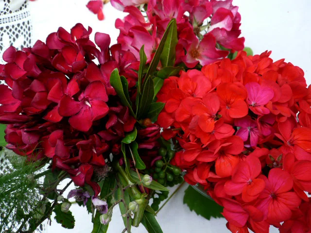
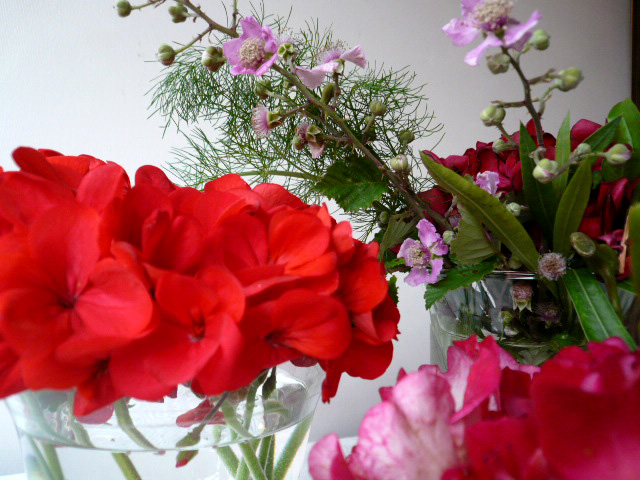
The hue that I chose was the glorious red of my geraniums. You’re probably asking why I started with the colour and not the flowers. The reason being it narrows down the variety available. It’s essential to stick to one shade or a colour scheme when choosing the flowers you’re going to use. Keeping in mind this rule allows us the freedom to select the flowers and focus on the variety of shades, shapes and texture. I finally decided to match the geraniums with some oleander flowers and roses all with different hues of red.
Yesterday while I was on my way home, a blooming blackberry bush caught my eye. The graceful and tiny flowers seemed to have being drawn by children and are a pleasant reminder that summer is nearly here. I decided to use these to add lightness and frivolity to the centre-piece.
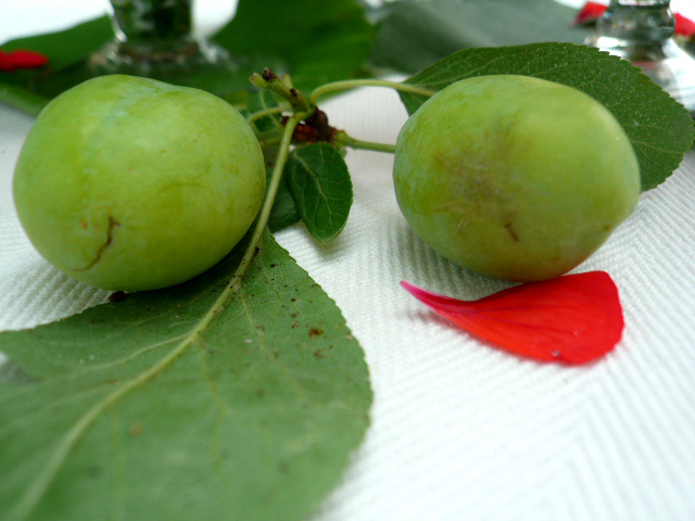
Fruit is also very useful when decorating a table. Shiny red cherries were the perfect choice that echoed the essence of summer. For movement and texture I added a sprig of rosemary, vine with tiny green grapes and some airy fennel bloom.
I use 3 small vases for this floral arrangement. Why 3? As the Latin saying goes “everything that comes in 3 is perfect”; a floral arrangement composed with 3 looks more natural and less forced than an even-numbered collection. Don’t be afraid to play around with the symmetry and asymmetry. Remember to use a simple vase if your composition is of a bold colour. For this centre-piece I used simple glass vases.
In a nutshell
Decide on one colour
Create a floral arrangement with 3 vases (glass or white ceramic or terracotta for a more rustic setting)
Add fruit to give an extra special touch
Enjoy and let yourself be transported by the colours
peonies
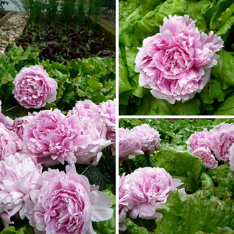
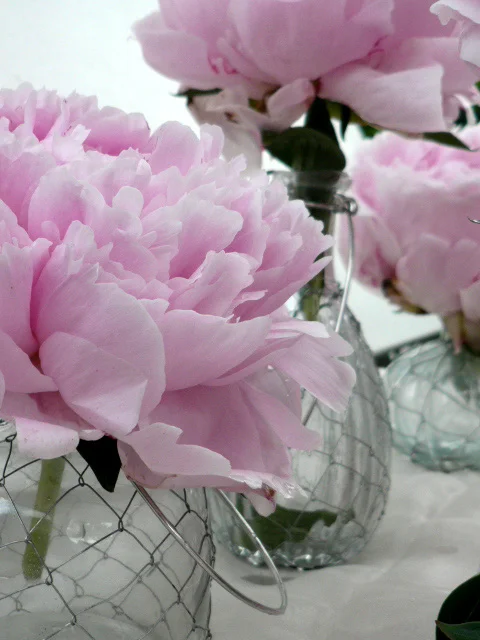
I’m always seduced in May by the majestic peonies. Being deeply in love with this flower I decided to give it my full attention with a shoot. First of all I started to look around my studio to find some objects to go with the peonies. I found some romantic little glass vases, some hand-made paper bags by Dutch stylist Ilvy Jacobs, an antique cake dish ... While I was deciding the best place for the shoot I came across the bright emerald lettuces growing in my vegetable patch. I thought it would be an unusual backdrop for some photos.
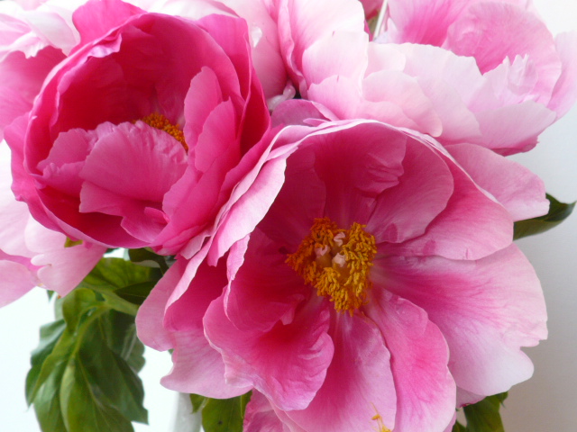
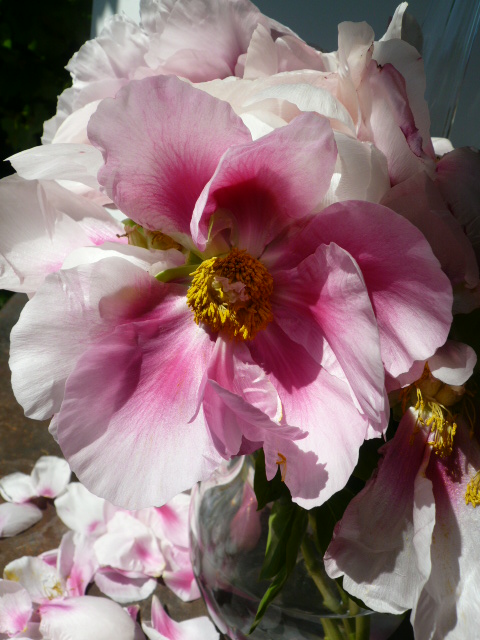
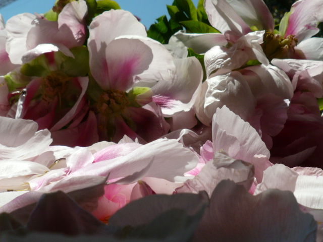
I selected one of my favourite variety of peony, the Sarah Bernhardt; with its delicate pink hue with some splashes of intense red near the stem. The metamorphosis of this flower always fascinates me. The peony bud starts out like a tightly closed fist, and then slowly becomes a flower rich in petals, a little bit ruffled and with that kind of crumpled look which I love so much. Plunging my face into the petals I feel their softness and freshness brush me. I don’t think you can find anything softer or more delicate. While I was buying them I just happened to find the peony Eventide which I saw for the first time. This peony is a single flowered one with its coral pink colour which fades until it becomes nearly translucent white. Only the single flowered variety opens in the day light and close at night.
The Sarah Bernhardt peony belongs to the herbaceous perennial plant, and was known in ancient Greece for its medicinal properties. It originally came from China where it was called the Queen of flowers. During the past centuries became more and more important and was an iconic flower. In 1903 The Qing dynasty declared it the national flower.
Enough small chat take a look for yourself!
If by any chance you are near Turin at the moment, go and visit the Commande nursery. This place was born out of passion for the peony. They have many different varieties of this magnificent flower.


